Accessibility is often discussed at the code level — semantic HTML, ARIA attributes, keyboard navigation.
But many of the decisions that define whether a product is accessible or not happen much earlier than that. Before the first component is built, before the first line of CSS is written, choices are already being made that will either support or compromise accessibility for every user who interacts with that product.
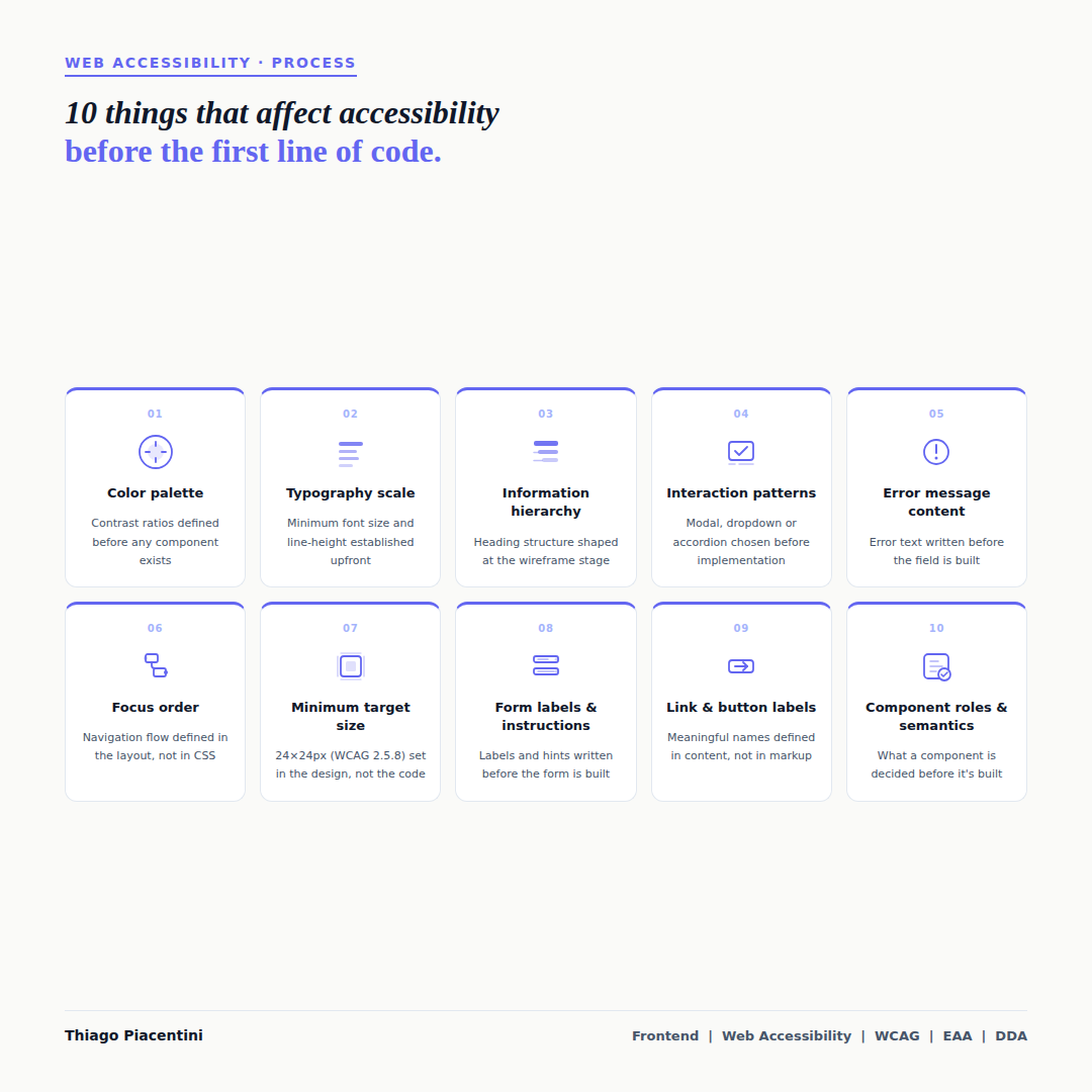
Here are 10 of those decisions — and why they matter before a developer opens their editor.
Color palette
Contrast ratios are not a development concern — they are a design decision. When a color palette is chosen without considering accessibility, developers inherit a system that fails WCAG 1.4.3 from the start. Defining minimum contrast ratios as part of the palette means every component built from it starts accessible by default.Typography scale
Minimum font size, line-height, and letter-spacing affect readability for users with low vision and cognitive disabilities. A typography scale that establishes these values upfront avoids the pattern where text is legible on a designer's monitor but fails at real-world reading distances or with browser zoom applied.Information hierarchy
The heading structure of a page — h1, h2, h3 — is not a code decision. It reflects the information architecture, which is defined at the wireframe stage. When that structure is unclear or skipped in the design phase, developers are left guessing, and screen reader users are left with a page that is difficult or impossible to navigate by heading.Interaction patterns
Choosing between a modal, a dropdown, an accordion, or an inline expansion is a design decision with significant accessibility implications. Each pattern has different keyboard interaction requirements, focus management expectations, and ARIA roles. Selecting a pattern without considering these means the implementation will either be inaccessible or require significant rework.Error message content
WCAG 3.3.1 requires that errors are identified and described in text. WCAG 3.3.3 recommends suggesting how to correct them. Both of these are content decisions — they depend on what the error message actually says. Writing error messages as part of the design and content process, not as an afterthought in the code, makes WCAG compliance significantly easier to achieve.Focus order
The order in which a keyboard user moves through a page should follow a logical and predictable sequence. That sequence is determined by the layout — not by CSS or JavaScript. When a design places elements in a visual order that does not reflect the content order, focus order becomes a problem that is difficult to fix without restructuring the layout itself.Minimum target size
WCAG 2.5.8 (Target Size — Minimum, Level AA) requires interactive targets to be at least 24×24 CSS pixels, with exceptions for spacing and inline elements. This is a sizing decision made in the design — not something that can be reliably added in CSS without affecting the surrounding layout. Establishing minimum target sizes as a design constraint prevents a class of failures before implementation begins.Form labels and instructions
Every form field needs a visible, meaningful label. Fields that rely only on placeholder text fail WCAG 1.3.1 and 3.3.2, because placeholder text disappears on focus and is not consistently announced by screen readers. Writing labels and instructions as part of the form design — not as a detail added during development — ensures they are meaningful, not generic.Link and button labels
"Click here", "Read more", or "Submit" — without context — are accessible name failures. WCAG 2.4.6 and 2.4.9 require that links and controls have descriptive names. These names come from content decisions: what does this button do? Where does this link go? When those questions are answered in the design and content phase, the implementation reflects the intent. When they are left for developers to infer, the result is often a generic label that tells a screen reader user nothing.Component roles and semantics
What a component is — a button, a navigation, a list, a dialog — determines what HTML element and ARIA role it should use. That decision is architectural, not syntactic. When components are designed without considering their semantic role, developers face a choice between using the wrong element or adding complex ARIA that attempts to compensate. Getting the role right starts with a clear design intent.
Accessibility does not belong to any one discipline. These decisions happen across design, content, and architecture — and the earlier they are made with accessibility in mind, the less costly they are to get right.
The question worth asking at the start of any project: at what stage does accessibility enter the conversation?