When we talk about heading structure — H1, H2, H3 — it can seem like a purely visual concern. A matter of font size, weight, and spacing on the screen.
But for users who rely on screen readers, headings are not visual elements. They are navigation landmarks — the primary mechanism through which a page can be explored and understood without sight.
How screen readers use headings
According to the W3C WAI Headings tutorial, headings communicate the organization of content on the page, and browsers, plugins, and assistive technologies use them to provide in-page navigation.
Screen readers like NVDA, JAWS, and VoiceOver provide keyboard shortcuts that allow users to jump directly between headings. The shortcut H moves to the next heading. 1 through 6 jump to headings of a specific level. This makes headings the equivalent of a table of contents — a way to scan the structure of a page and navigate directly to the section that matters, without reading through every element in between.
When a user presses H, the screen reader announces both the heading text and its level: "Heading level 2: What is WCAG". That level information is what allows the user to understand where they are in the document hierarchy — whether they are in a main section or a subsection, and how sections relate to each other.
The image shows the same content structured two different ways. On the left, a broken hierarchy: three H1 elements, a jump from H1 directly to H3 with no H2 in between, and an H2 appearing after H3s — each a distinct failure. On the right, the correct hierarchy: a single H1, followed by H2s for main sections and H3s for subsections, in a logical and predictable order.
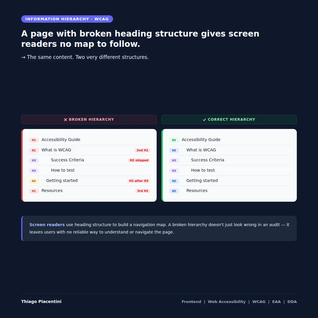
What a broken hierarchy looks like in practice
The broken structure on the left demonstrates three of the most common heading errors:
Multiple H1 elements. A page should have a single H1 that describes its main topic. When multiple H1s exist, a screen reader user navigating by heading level 1 encounters what appears to be several unrelated pages — or worse, cannot determine what the page is actually about.
Skipped heading levels. Jumping from H1 directly to H3, without an H2 in between, breaks the logical nesting of content. A user navigating by H2 to find main sections will skip over content that was marked as H3 — not because they missed it, but because their navigation shortcut doesn't surface it at that level.
Out-of-order headings. An H2 appearing after H3 elements signals a structural inconsistency. The document outline becomes unpredictable, and the user loses the ability to reliably infer the relationship between sections.
Visual styling and semantic structure are separate concerns
This is a critical distinction that affects how both designers and developers approach heading decisions.
If a design requires a section title to appear visually smaller or lighter than the surrounding content, the correct solution is CSS — not downgrading the heading level. A title that looks like body text but is semantically an H2 is perfectly valid. A title that looks like an H2 but is marked as H3 to achieve a visual effect is a structural failure.
The heading level communicates meaning and hierarchy to assistive technologies, search engines, and the document outline. The visual style communicates appearance. These two concerns must be kept independent.
The WCAG criteria
Two WCAG criteria are directly relevant here:
WCAG 1.3.1 — Info and Relationships (Level A) requires that information, structure, and relationships conveyed through visual presentation are also available in a way that can be programmatically determined. A heading that appears visually prominent but is not marked as a heading in the HTML fails this criterion. A heading marked at the wrong level misrepresents the structure of the content.
WCAG 2.4.6 — Headings and Labels (Level AA) requires that headings and labels describe the topic or purpose of the content they introduce. This criterion goes beyond structure — it addresses meaning. A heading that exists at the correct level but carries a vague or generic label still fails to give assistive technology users the information they need to navigate efficiently.
Both criteria address the same underlying principle: structure and meaning must be communicated through the markup, not just through visual presentation.
The failure is silent and invisible to sighted users. But for anyone navigating with a screen reader, a broken heading hierarchy is the difference between a page that can be navigated efficiently and one that must be read linearly from top to bottom — removing the primary advantage that assistive technologies provide.
References: