Last week, I wrote about how form errors are invisible to screen readers — violating WCAG 4.1.3 Status Messages. But there's another layer to this problem that most developers overlook, even when they do add a visible error message.
Color alone is not enough.
Turning a border red or writing "Invalid" in red text fails users with color blindness — and it directly violates WCAG 1.4.1 Use of Color.
An accessible error message needs three things working together:
- A non-color indicator — like an icon
- A clear, descriptive message — not just "invalid"
- A format suggestion to guide the correction
Small changes. Big impact on real users.
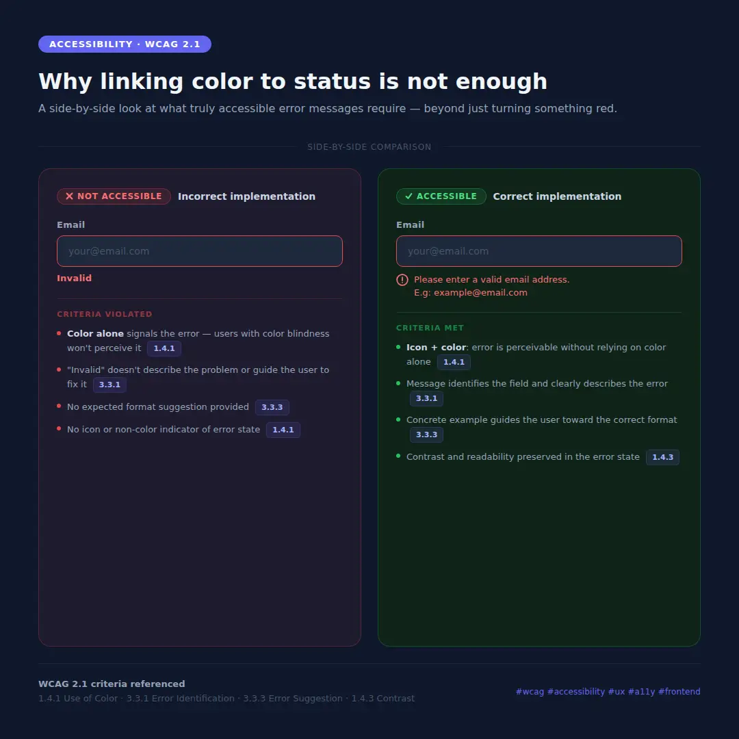
The image above shows exactly what this looks like in practice — the wrong way and the right way, side by side.
WCAG 2.1 criteria referenced:
- 1.4.1 Use of Color — color must not be the only visual means of conveying information
- 3.3.1 Error Identification — errors must be described in text
- 3.3.3 Error Suggestion — suggestions for correction must be provided
- 1.4.3 Contrast (Minimum) — text contrast must meet 4.5:1 (AA)