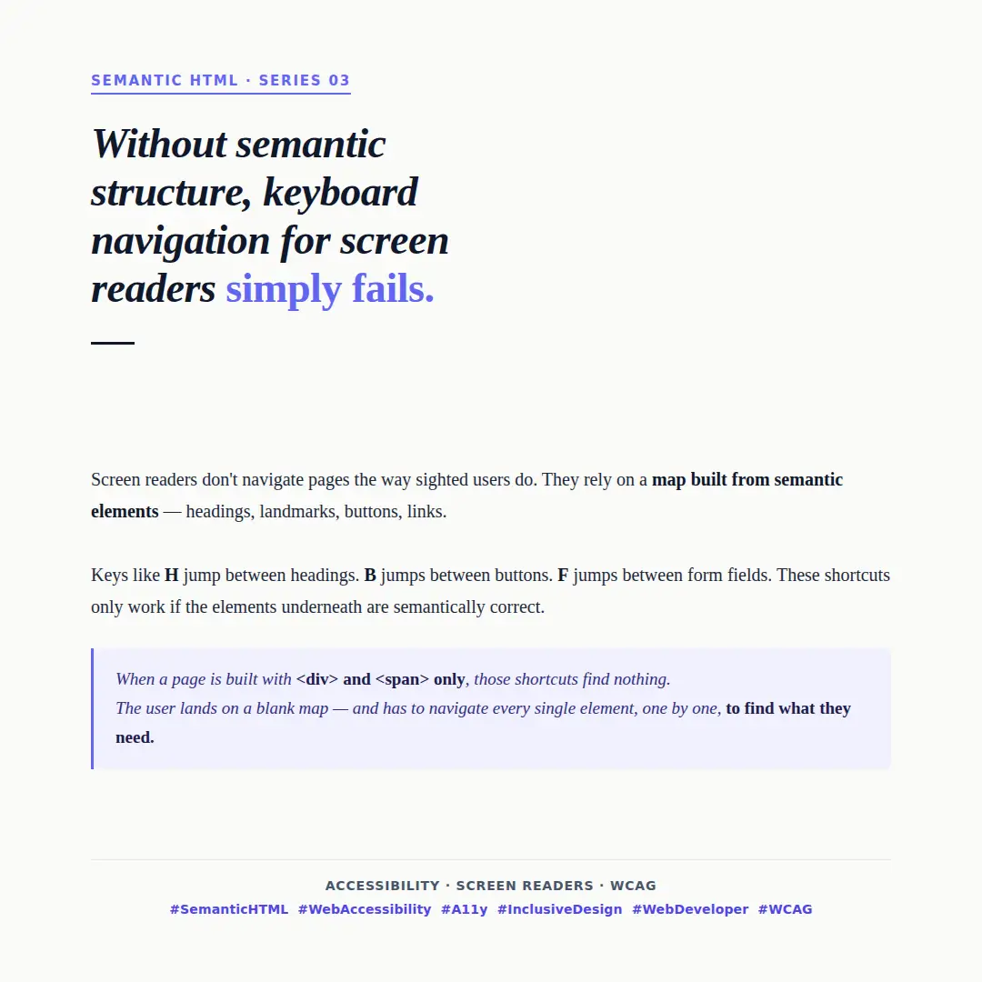
Screen readers don't navigate pages the way sighted users do. They rely on a map built from semantic elements — headings, landmarks, buttons, and links.
When that map exists, keyboard shortcuts make navigation fast and efficient:
- H jumps between headings
- B jumps between buttons
- F jumps between form fields
- L jumps between lists
These shortcuts only work if the elements underneath are semantically correct.
What the wrong structure looks like
Consider a navigation menu built entirely with <div> and <span>:
<!-- No semantic structure — screen reader sees anonymous boxes -->
<div class="nav">
  <span onclick="navigate('/home')">Home</span>
  <span onclick="navigate('/about')">About</span>
  <span onclick="navigate('/contact')">Contact</span>
</div>
A screen reader user pressing L to jump to navigation finds nothing. Pressing Tab to reach the links also finds nothing — <span> elements are not focusable by default. The user has no choice but to read through every element on the page sequentially.
Now compare with the semantic equivalent:
<!-- Semantic structure — screen reader announces "navigation" landmark -->
<nav aria-label="Main navigation">
  <a href="/home">Home</a>
  <a href="/about">About</a>
  <a href="/contact">Contact</a>
</nav>
The browser announces the landmark. The user can jump directly to it. The links are natively focusable and announced correctly.
Headings are your page outline
Screen reader users commonly navigate by headings first to get an overview of the page before reading content — similar to how sighted users scan visually.
<!-- Wrong — styled text that looks like a heading but isn't one -->
<div class="heading-xl">Getting started</div>
<div class="heading-lg">Installation</div>
<div class="heading-lg">Configuration</div>

<!-- Right — a real heading hierarchy the screen reader can announce -->
<h1>Getting started</h1>
<h2>Installation</h2>
<h2>Configuration</h2>
With the first example, pressing H finds nothing. With the second, the user gets the full document outline in seconds.
Buttons that aren't buttons
Interactive elements built on non-interactive HTML are a common source of keyboard failures:
<!-- Wrong — div has no keyboard role, not focusable, not announced as button -->
<div class="btn" onclick="submitForm()">Submit</div>

<!-- Right — natively focusable, announced as button, activatable with Space and Enter -->
<button type="button" onclick="submitForm()">Submit</button>
When <div> is used instead of <button>, keyboard users cannot reach the element at all unless tabindex and role="button" are manually added — and even then, Space and Enter handlers must be implemented manually. The native element gives you all of this for free.
The real cost
This is not a minor inconvenience. For someone navigating exclusively by keyboard or screen reader, a page without semantic structure can take significantly longer to use — or become impossible to navigate entirely.
The fix is almost always simpler than the workaround. Using <nav>, <main>, <button>, <h1> — the right element for the right purpose — is what creates the map. No ARIA required, no extra JavaScript.
Semantic HTML isn't just good practice. For screen reader users, it is the difference between a page that works and one that doesn't.