In a previous post, I wrote about which screen reader and browser combinations are most used in the real world, based on the WebAIM Screen Reader User Survey #10. JAWS with Chrome at 24.7%, NVDA with Chrome at 21.3%, and three other pairings that together cover the majority of desktop screen reader usage.
That data is valuable. It tells you where to start when you have nothing else to go on.
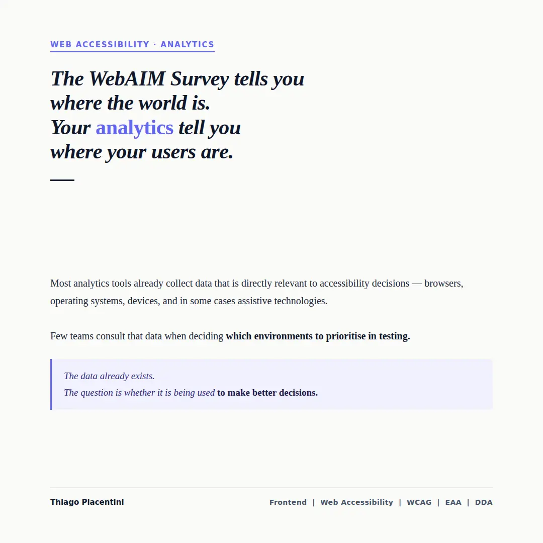
But it has a fundamental limitation: it describes the world in aggregate. It does not describe your users.
What your analytics already know
Most analytics platforms — Google Analytics, Plausible, Fathom, and others — collect data about the technical environment of every visit. This includes:
- Browser — Chrome, Safari, Firefox, Edge, and their versions
- Operating system — Windows, macOS, iOS, Android, Linux
- Device type — desktop, mobile, tablet
- Screen resolution — relevant for understanding how interfaces are actually rendered
Some platforms, when configured correctly, can also surface data about accessibility-related browser features — though this varies significantly by tool and configuration.
This data is collected by default. It is available in most dashboards. And it is almost never consulted when teams make decisions about accessibility testing environments.
Why it matters for testing decisions
Consider two products with very different user bases.
A government service used predominantly by older adults on Windows desktops has a testing profile heavily weighted toward JAWS and NVDA with Chrome or Edge. A mobile-first consumer application with a younger audience may have 70% of its traffic coming from iOS — making VoiceOver with Safari the highest-priority combination to validate.
The WebAIM Survey would point both teams in the same direction. Their analytics would not.
Testing the wrong combination is not a waste of time in isolation — any screen reader testing is useful. But prioritising the wrong combination means that the most common experience your actual users have may be the least tested one.
The gap between data and decisions
The data exists. The problem is that it rarely flows into the accessibility conversation.
Accessibility decisions tend to be made by developers and QA engineers working from general guidance — WCAG criteria, survey data, tooling defaults. Analytics data tends to live in dashboards consulted by product managers and marketing teams for different purposes.
Bridging that gap is a process question, not a technical one. It does not require new tools. It requires asking the question: before we decide what to test, what do we know about who is using this product and how?
The answer is usually already available. It is just not being consulted.
A practical starting point
Before your next accessibility testing cycle, pull the browser and operating system breakdown for your product from whatever analytics tool you use.
Look at the top three or four combinations. Cross-reference them with the screen reader pairings that are most associated with each operating system. Adjust your testing priorities accordingly.
It takes less time than a full audit. And it ensures that the effort you invest in testing is directed at the environments your actual users depend on.